
Pouring Petals Tea
Serial Design, Packaging, Poster Design | March 2025
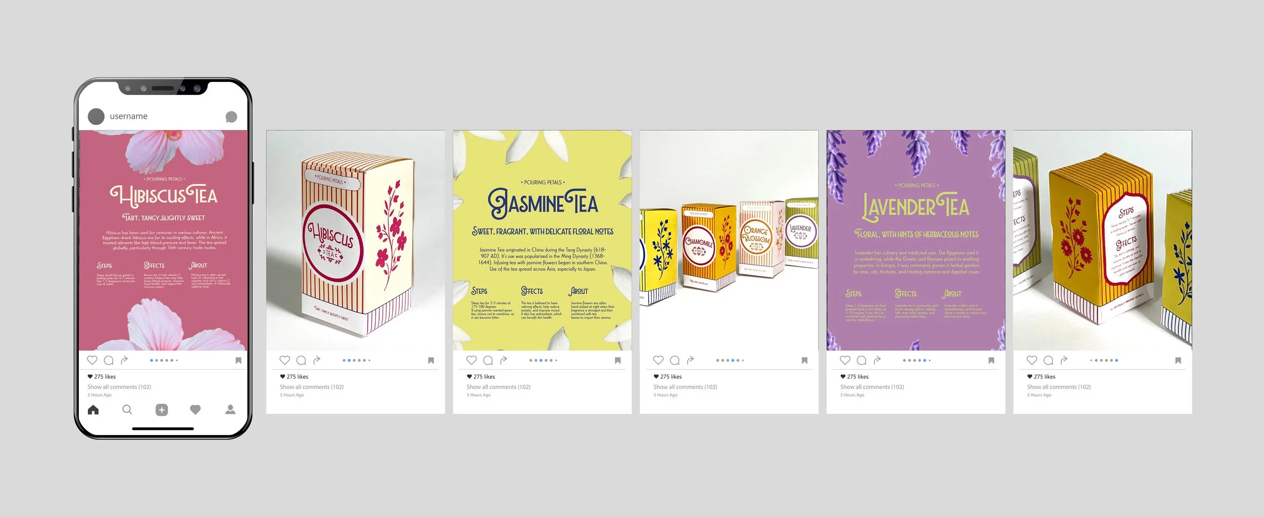
Pouring Petals Tea is a conceptual brand system exploring how a cohesive visual language can evolve from posters into packaging.
The project began with five typographic posters, designed as a structured series that progressed from simple to complex compositions, experimenting with hierarchy, rhythm, and the relationship between type and space.
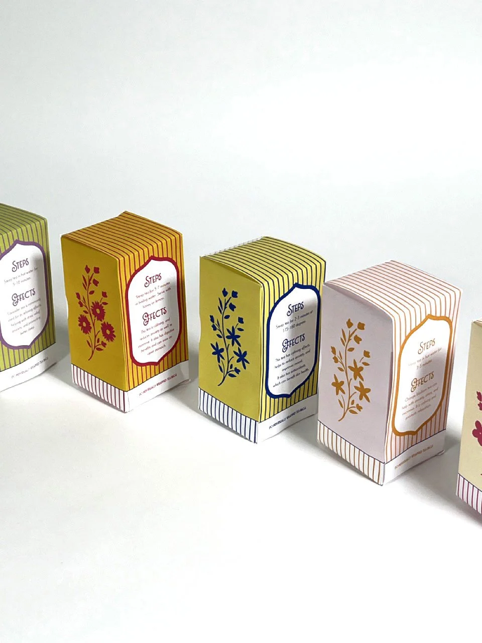
These posters formed the foundation for a larger identity system adapted into packaging for a fictional tea brand.
Tools: InDesign, Illustrator, Photoshop
Behind The Design
To create a unified system, I applied principles of serial design, ensuring each piece could stand alone while remaining part of a cohesive family.
I established typographic consistency and grid-based layouts in the poster phase, then extended the system into packaging with color, floral imagery, and graphic accents to differentiate tea varieties while maintaining hierarchy, clarity, and brand cohesion.
Prototyping helped refine layouts for physical forms, ensuring readability and visual impact on shelves.
Through these decisions, the project demonstrates how a visual system can scale across media, both expressively and functionally.
Pouring Petals Tea strengthened my ability to adapt design frameworks across formats, balance cohesion with variation, and think critically about hierarchy, rhythm, and brand communication.